Continuing with The Bad Actor Report series, in this article we go into detail about what a bad actor report looks like and how you can take advantage of this important data.
If you missed my first few posts, you can check them out here ⤵
Before a Pareto-style report can be finalized, it is required to identify the sort metric as this is what provides the sort order on the report. A Pareto-style report is a type of chart that contains both bars and a line graph, where individual values are represented in descending order by bars and the cumulative total is represented by the line. There are many possibilities of which several could be of use, meaning, it may be beneficial to run the report using multiple sorts.
The sort-metric options would be shown as report prompts, shown below:
-
Those assets with the most work orders written against them.
-
This structured query language (SQL) selection would focus on completed repair work with functional failures.
-
-
Mean time between failure (MTBF).
-
Asset condition.
-
Maintenance downtime.
-
The Society for Maintenance & Reliability Professionals (SMRP) number one economic indicator
-
Which is average annual maintenance cost divided by replacement cost.
-
-
Asset criticality
-
Sometimes called business risk exposure (BRE)
-
Possible filters include date range (age), plant system, location, manufacturer and BRE. Also note there is an asterisk option which shows those assets that have been placed on the operations (or engineering) manager watch list, meaning they are “at risk” due to current engineering studies underway.
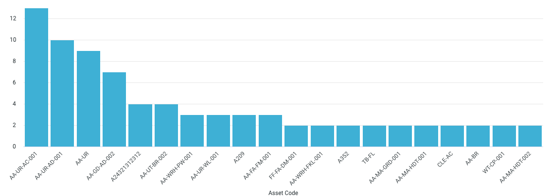
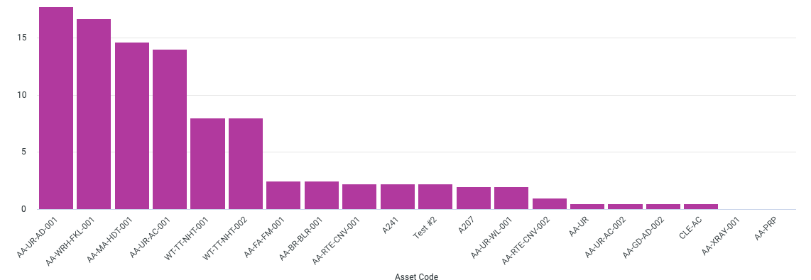
Here are two examples of Fiix’s Top 10 Hitters report:


How do you structure your bad actor data? Let us know in the replies below. ![]()
Keep an eye out for my next and final article. We’ll go into why the bad actor report is likely the most important report you can have.


